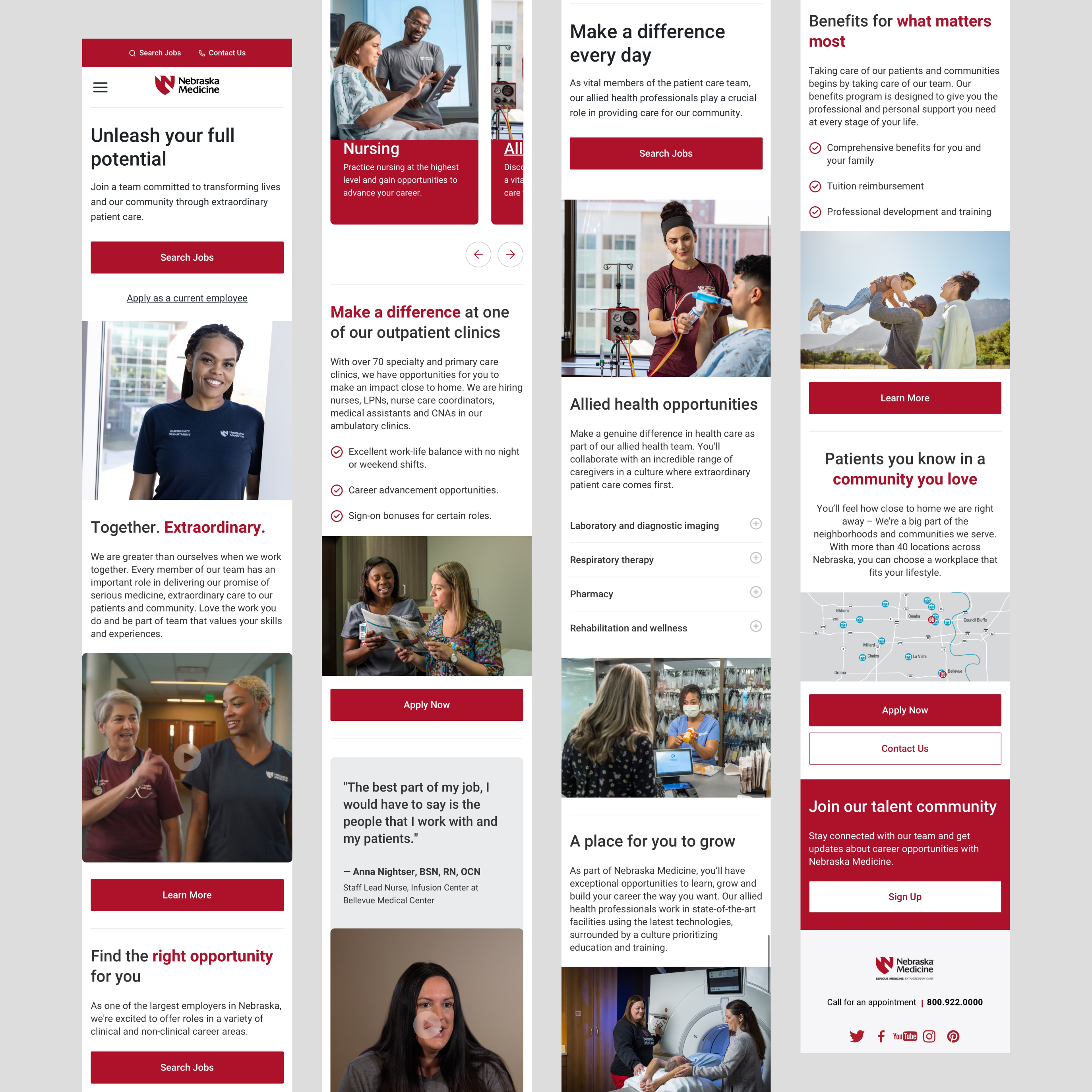
Together. Extraordinary.
As a Senior User Experience Designer at Nebraska Medicine – any surface, on platform or off, where a patient or provider might encounter touch points from our company, is my responsibility. Success in the role means collaboration across our platform team, the centralized marketing team, as well as with members of the developer group.The project shown here focuses on an initiative to better showcase the brand language for employment, with a specific focus on recruitment and retention.
User Experience Designer, Marketing Operations, Human Resources, Copywriters, Engineers
User Experience Designer, Marketing Operations, Human Resources, Copywriters, Engineers
7 months

Problem
Differentiating Nebraska Medicine as the employer of choice
"I would have never really come across this page myself"
It was only through multiple attempts that I eventually stumbled upon the information I needed. Specifically, I came across a job posting that intrigued me, but the process of finding additional details about the role, such as the application instructions, company culture, and associated benefits proved to be overly complex. I would have never found this information myself on the website had I not been determined to do so.
Registered Nurse, 32 years old, newly joined
Through a process of generative coding, I identified emergent themes and patterns from responses of 9 interview participants. From challenges in discoverability to the frustrations of information overload, each insight served as a cornerstone to enhance the user experience.
Learning from what exists
Simultaneously, I conducted a heuristic analysis of the website to assess its usability and identify potential areas for improvement. It unveiled several notable findings,


These discoveries hold particular significance for individuals browsing for job opportunities. Job seekers heavily rely on seamless navigation, clear presentation of information, and effortless access application procedures. Any hindrances encountered during the browsing experience can discourage qualified candidates from further exploration, potentially leading them to seek opportunities elsewhere.
Guiding principles
Retention, Recruitment, and Branding
I worked with our Human Resources and Marketing Operations team to create guiding principles for the project to set a clear framework and direction for design decisions.

Retention efforts to prioritize existing colleagues' pride and involvement in the campaign.
Recruitment focused on showcasing appealing attributes through visuals and clear copy.
Three: Modern, accessible design that reflects the care provided at Nebraska Medicine.
These principles serve as a roadmap for designing experiences that resonate with both internal and external stakeholders, ultimately contributing to the project's success and the organization's overall objectives.

Process
How might we foster pride amongst existing colleagues?
Enhancing the website's visual appeal and personalization for potential roles at involved showcasing existing employees in their work environment and sharing their positive experiences.
For this, I interviewed 44 employees from diverse roles, including leadership, physicians, nurses, and corporate, to capture firsthand insights into their experiences at Nebraska Medicine. The interviews (shown above) were then transformed into short-form videos, serving as testimonials featured on the website.
Additionally, I directed a photoshoot aimed at ensuring diversity and inclusivity, guiding the artistic direction to encompass various individuals representative of the organization.
How might we simplify our purpose to its core essence?
We went through the process of scrubbing the copy and revamping the brand presence for each of the websites pages, working hand-in-hand with the Marketing and Human Resources to find a balance of their vision and what we felt we could accomplish confidently, in line with the new EVP.
We needed to acknowledge that we have unique job applicants, and our copywriting framework should be adaptable to reflect those variables. We wanted to create designs that support the specifics of the content, writing style and tone of voice for each role.

The happy path
Working closely with a Digital Strategist, I refined the user journey, creating a unified and smooth experience across various devices. With just 28 pages, the restructured information architecture was 35% more efficient.

How might we make our brand design accessible to all?
The third guiding principle, Brand, required the creation of a strong and scalable design system. This system was developed to enhance the existing brand guidelines by incorporating WCAG compliance and ensuring mobile responsiveness.
Leveraging design tokens and component libraries, I developed a system that not only anticipates future design needs but also facilitates seamless integration with engineering workflows.
The design system was meticulously documented, providing clear guidelines on the application of UI patterns and components within this project and for future expansions.
Read more about the Nebraska Medicine Design System
The best way to have a good idea is to have lots of ideas
At this stage, we set out to brainstorm and ideate what the website could look like, with the goal of improving our page depth and navigation metrics. We wanted to create a performant experience that not only gave job applicants using various devices the best possible experience but also a backend that was easy to maintain for the internal CMS.

During the development of the second template, we identified common elements in all blocks—heading, body text, image, and a call-to-action (CTA). This discovery guided our modular approach, allowing these components to be rearranged while ensuring design consistency and visual appeal.
✴️ Aha! moment
Solution
Putting it all together
By seamlessly integrating diverse perspectives and a forward looking design, we crafted a digital experience that resonated deeply with our audience while successfully meeting our business objectives.

Impact
Small changes make the biggest difference
The third guiding principle, Brand, necessitated a robust, scalable design system that adhered to WCAG compliance and featured mobile responsiveness, ensuring accessibility and inclusiveness.
Leveraging design tokens and component libraries, I developed a system that not only anticipates future design needs but also facilitates seamless integration with engineering workflows.
The design system was meticulously documented, providing clear guidelines on the application of UI patterns and components within this project and for future expansions.


